Articles
How to Create a Gradient Text Stroke Effect Using HTML & CSS
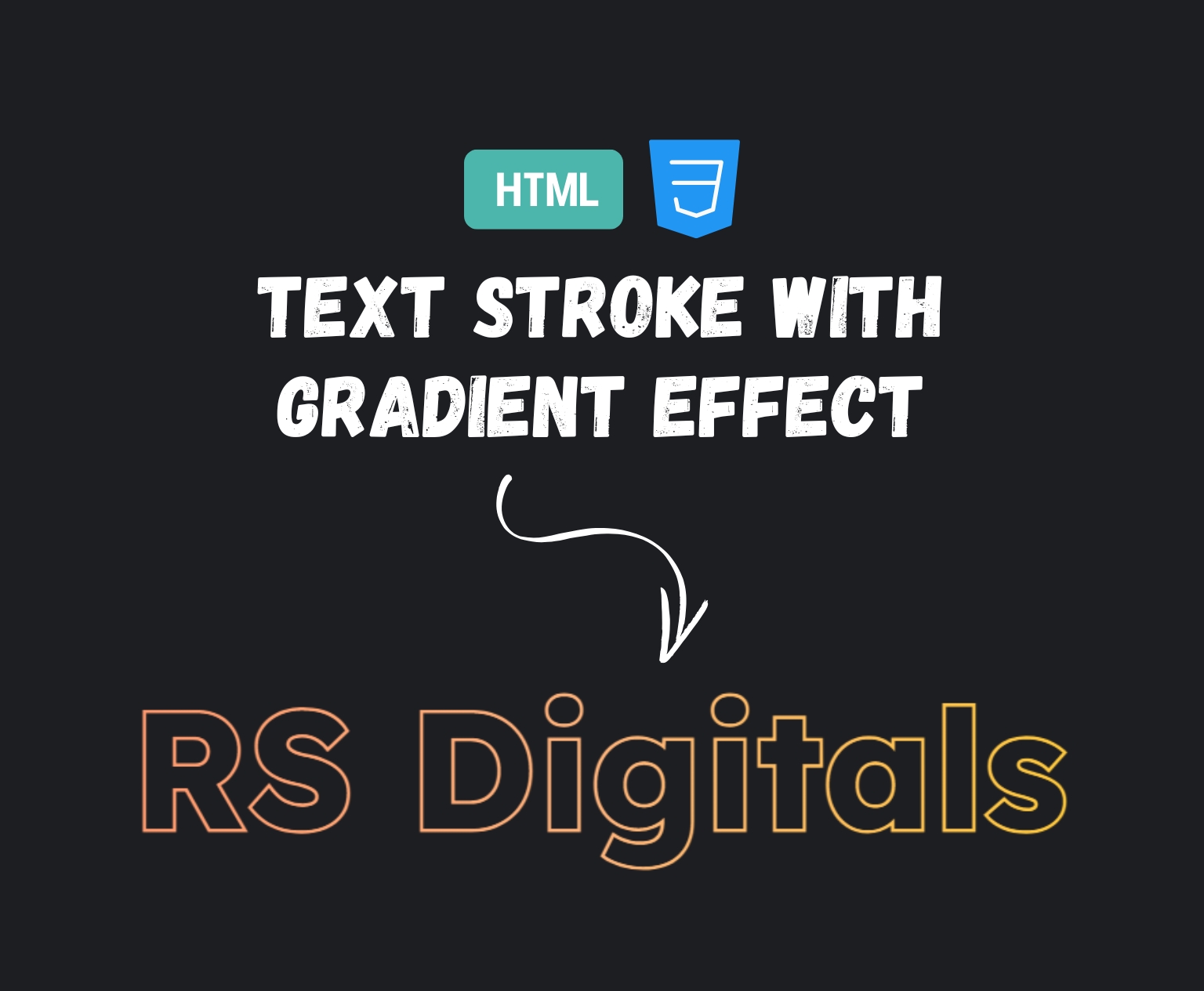
If you’re trying to spice up your web’s typography, then you’re in the right place. In this blog, we’ll demonstrate how you can create an amazing text stroke effect by using a gradient effect with just HTML and CSS. It’s an easy but powerful design technique that will enhance your text and make it stand out on any page. Whether you’re new to CSS or want to improve your CSS skills, there’s something here for you. Let’s create something new with CSS!
HTML Code
Let’s kick things off with the HTML. Below is the complete structure you’ll need:
<!DOCTYPE html>
<html>
    <head>
        <title>Text Stroke with Gradient Effect</title>
        <link href="style.css" rel="stylesheet" />
    </head>
    <body>
        <h1 class="heading">RS Digitals</h1>
    </body>
</html>
Breaking It Down:
<!DOCTYPE html>tells the browser that this is an HTML5 document.- The
<html>tag wraps the entire content of the webpage. - Inside the
<head>, we have the<title>, which sets the name of the tab or browser window. - The
<link>tag connects an external CSS file calledstyle.csswhere we’ll write all the styling magic. - In the
<body>, we’ve added an<h1>element with the classheading. This is the text we’re going to style with a gradient stroke effect.
Now that we’ve set up the structure, let’s move on to the fun part—styling it with CSS!
CSS Code
Now that we’ve got the HTML structure in place, it’s time to bring the magic with CSS! Here’s the complete CSS code we’ll use to create a beautiful gradient-stroked text effect:
@import url('https://fonts.googleapis.com/css2?family=Lexend+Deca:wght@100..900&display=swap');

body {
    background: #1d1e22;
}

.heading {
    text-align: center;
    padding: 140px 0px;
    font-size: 9vw;
    color: #1d1e22;
    background-clip: text;
    background-image: linear-gradient(to right, #ff7e5f, #feb47b, #ffdd00);
    -webkit-text-stroke-color: transparent;
    -webkit-text-stroke-width: 5px;
    letter-spacing: 1px;
    font-family: "Lexend Deca", sans-serif;
}
Let’s break it down:
- Font Import: We’re importing the Lexend Deca font from Google Fonts to give our heading a modern and clean look.
body: We’re setting the background of the entire page to a dark shade (#1d1e22) to make the gradient text pop..heading: This is where the real styling happens:text-align: centercenters the heading horizontally.padding: 140px 0pxadds vertical spacing to position the text nicely in the viewport.font-size: 9vwmakes the text responsive—it will scale based on the width of the screen.color: #1d1e22is the base color of the text, which will be masked by the background clip.background-image: linear-gradient(...)creates the gradient that we want to apply to the stroke.background-clip: textand-webkit-background-clip: text(you should add the webkit version for broader browser support) allow the background gradient to appear through the text.-webkit-text-stroke-width: 5pxand-webkit-text-stroke-color: transparentcreate a transparent stroke that lets the gradient shine through.letter-spacing: 1pxgives a bit of breathing space between each character.font-familyapplies the stylish Lexend Deca font to the heading.
Pro tip: Don’t forget to add -webkit-background-clip: text; to ensure the gradient appears correctly in most browsers like Chrome and Safari.Up next, we’ll see the final output and maybe even play around with a few customization ideas. Stay with me—this is where it gets visually satisfying!
See It Live
Want to see the magic in action? Check out the live preview below! You can interact with the code, tweak the styles, and see real-time changes directly in the embedded CodePen. It’s a great way to experiment and get a feel for how the gradient text stroke effect works.
Go ahead, play around with it and make it your own!
See the Pen Text Store with Gradient by Rohail Ali (@Rohail1123) on CodePen.
Final Thoughts
That’s it! In this article, we showed you the steps to create an attractive text stroke effect using an elongated gradient with just HTML and CSS. By using a simple HTML structure and creatively applying CSS properties such as background-clip, text-stroke, and linear gradients, you’ll be able to instantly enhance your headlines or hero text.
This is a straightforward but powerful method to make your content stand out. And the greatest part? No JavaScript required!
Explore various fonts, gradient colors, or stroke widths to fit your website’s design. If you found this article helpful, don’t forget to share it or leave your thoughts in a comment. Happy coding!