Articles
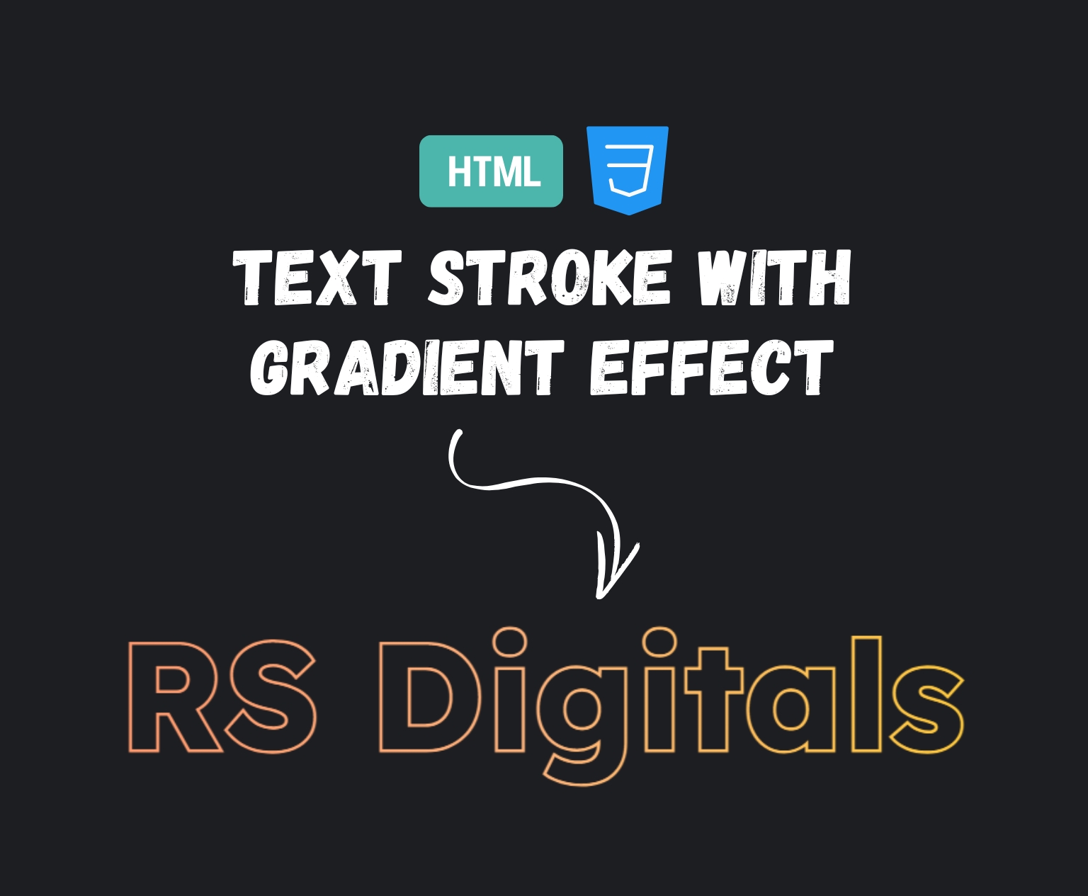
CSS Trick: Grainy Text Effect Without JavaScript
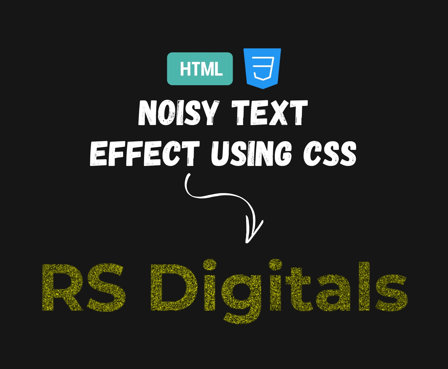
If you’re trying to create a stylish and elegant look for your site’s typography and text, then a grainy texture is a nice touch. What’s more? It doesn’t require any fancy graphics tools or images from the internet—just simple HTML and CSS. In this video tutorial, I’ll guide you through how you can create a gritty text effect using a basic mixture of CSS filters, background layers, and blend mode. Whether you’re creating a webpage header, landing page, or portfolio, this method gives the text a unique and eye-catching look. Let’s get started!
HTML Code
<!DOCTYPE html>
<html>
    <head>
        <title>Text Grainy Effect</title>
        <link href="style.css" rel="stylesheet">
    </head>
    <body>
        <h1 class="grainy-text">RS Digitals</h1>
    </body>
</html>
What’s Happening in This Code?
Let’s break it down quickly:
<!DOCTYPE html>declares the document type and helps the browser render the page correctly.- The
<html>tag wraps all the content on the page. - Inside the
<head>, we have the<title>tag which sets the title that appears on the browser tab (in this case, “Text Grainy Effect”). - The
<link>tag connects an external CSS file (style.css) where we’ll write the styles for our grainy effect. - Inside the
<body>, we have a single<h1>element with the classgrainy-text. This is where our effect will be applied.
This HTML structure is minimal and clean—perfect for focusing solely on the visual effect we’re about to create. Next, we’ll move on to the CSS part, where all the magic happens.
CSS Code
body {
    background-color: #161616;
}

.grainy-text {
    font-size: 9vw;
    font-weight: bold;
    text-align: center;
    font-family: "Montserrat";
    color: transparent;
    background:
        repeating-radial-gradient(#161616 0 0.0001%, #fafd14 0 0.0002%) 30% 10% / 40vw 40vw,
        repeating-conic-gradient(#161616 0 0.0001%, #fafd14 0 0.0002%) 70% 70% / 60vw 60vw;
    background-clip: text;
    -webkit-background-clip: text;
    text-fill-color: transparent; /* For Safari */
    background-blend-mode: difference;
    margin: 120px 0;
}
What’s Happening in This CSS?
Let’s walk through the important parts:
bodybackground: We’re setting a dark background color (#161616) for contrast so the grainy yellow pattern pops..grainy-textstyling:font-size: 9vw;makes the text responsive, scaling with the width of the viewport.font-weight: bold;andfont-family: "Montserrat";give the text a modern, clean appearance.color: transparent;makes the text itself invisible, allowing the background to show through.
- Background magic:
- We’re layering two repeating gradients:
repeating-radial-gradientcreates a speckled pattern using dark and bright colors in microscopic steps (0.0001% and 0.0002%).repeating-conic-gradientadds additional variation and texture.
- These two backgrounds are positioned and sized differently to avoid looking too uniform, which adds to the natural, grainy look.
- We’re layering two repeating gradients:
- Text clipping:
background-clip: text;and-webkit-background-clip: text;ensure the gradient only fills the text, not the entire element box.text-fill-color: transparent;is a Safari-specific rule to fully reveal the background inside the text.
background-blend-mode: difference;:- This blend mode helps the two gradients interact in a way that increases the contrast and texture, giving it that “grain” effect.
- Margin: Adds vertical spacing to center the text on the page nicely.
This technique is great because it doesn’t rely on any external images or JavaScript. It’s lightweight, responsive, and works in modern browsers with good CSS support. Plus, it’s fully customizable—you can tweak the colors, gradient types, and blend modes to create your own unique variation of the effect.
See It Live
Are you interested in seeing the grainy text effect in action? Watch the live demo below! I’ve added a CodePen preview for you to see exactly how the effect appears on the web. You are free to play around with the code, alter the settings, or experiment with your own designs. This is a fantastic opportunity to practice and understand how CSS properties can be used to provide a distinct, visually appealing experience.
See the Pen Noisy Text Effect Using CSS by Rohail Ali (@Rohail1123) on CodePen.
Summary
In this post, we explored methods to make a stylish text texture using HTML as well as CSS. It is not necessary to use JavaScript or images. The first step was to create the basic HTML structure. We then used a variety of powerful CSS techniques such as repeating shades, background-clip: text, as well as blend modes, to make text that has a beautiful texture.
This effect is lightweight, responsive, and fully customizable—perfect for adding creative flair to headers, banners, or hero sections on your website. If you’re beginning to play around with CSS or are a seasoned web designer who wants to add visual interest to your web designs, it’s a technique to have in your arsenal.
Do you want to make your personal version? Return to the live demo and try out the program!