Articles
How to Create a Sliced Text Effect Using CSS – A Step-by-Step Guide
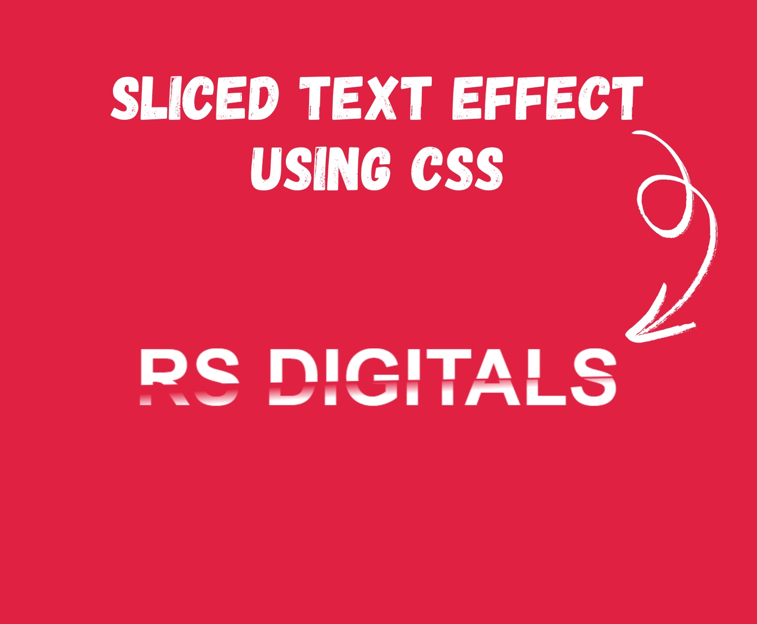
Do you want to bring a clean, contemporary look to your site’s style? The text slice effect is an elegant option to help your titles or headings make an impact. The greatest aspect? It’s done with only CSS! If you’re just starting out or a seasoned developer, this step-by-step guide will take you through the steps to build the effect of sliced text completely from the ground up.
Before we dive into how to create the sliced text effect, take a look at the example below to see what it looks like in action:

Setting Up the HTML
<!DOCTYPE html>
<html>
    <head>
        <link href="style.css" rel="stylesheet">
        <title> Code By RS Digitals </title>
    </head>
    <body>

        <div class="wrapper">
            <div class="top-text">RS Digitals</div>
            <div class="bottom-text" aria-hidden="true">RS Digitals</div>
        </div>

    </body>
</html>
Here’s the important bit of code from the example above that you’ll want to pay attention to:
        <div class="wrapper">
            <div class="top-text">RS Digitals</div>
            <div class="bottom-text" aria-hidden="true">RS Digitals</div>
        </div>
We have a div element with the class “Wrapper,” and inside this element, there are two additional div elements. The first one has the class “top-text” and contains the text “RS Digitals.” Below that, there’s another div with the class “bottom-text” and the attribute aria-hidden="true".
What does aria-hidden="true" mean?
The aria-hidden="true" attribute is used to hide content from screen readers, which are used by visually impaired users to navigate websites. By adding aria-hidden="true", you’re essentially telling screen readers to ignore the content within that element. This is useful when you want to hide something visually but still keep it in the code for other purposes.
Inside this second div, we have the same text, “RS Digitals,” as in the first div.
If you’d like to use different text, just make sure the same text appears inside both div elements. For example, if you want to replace “RS Digitals” with “Shopify,” simply add “Shopify” inside both div elements. Below is an example of how the final result will look.
        <div class="wrapper">
            <div class="top-text">Shopify</div>
            <div class="bottom-text" aria-hidden="true">Shopify</div>
        </div>
Now that we’ve set up the HTML structure, let’s move on to styling it with CSS. Below is the CSS code that brings the sliced text effect to life.
Setting Up the CSS
.wrapper {
    display: grid;
    place-content: center;
    background-color: #e12141;
    min-height: 100vh;
    font-family: "Oswald", sans-serif;
    font-size: clamp(1.5rem, 1rem + 18vw, 15rem);
    font-weight: 700;
    text-transform: uppercase;
    color: #FFFFFF;
  }

  .wrapper > div {
    grid-row-start: 1;
    grid-column-start: 1;
    grid-row-end: -1;
    grid-column-end: -1;
  }

  .top-text {
    clip-path: polygon(0% 0%, 100% 0%, 100% 48%, 0% 58%);
    font-size: 100px;
  }

  .bottom-text {
    clip-path: polygon(0% 60%, 100% 50%, 100% 100%, 0% 100%);
    color: transparent;
    background: -webkit-linear-gradient(177deg, #e12141 53%, #FFFFFF 65%);
    background: linear-gradient(177deg, #e12141 53%, #FFFFFF 65%);
    background-clip: text;
    -webkit-background-clip: text;
    transform: translateX(-0.02em);
    font-size: 100px;
  }
Let’s break down the CSS code step by step so you can fully understand how it works.
.wrapper {
    display: grid;
    place-content: center;
    background-color: #e12141;
    min-height: 100vh;
    font-family: "Oswald", sans-serif;
    font-size: clamp(1.5rem, 1rem + 18vw, 15rem);
    font-weight: 700;
    text-transform: uppercase;
    color: #FFFFFF;
}- The
.wrapperclass uses CSS Grid (display: grid) to center its content both horizontally and vertically withplace-content: center. - The background color is set to a vibrant red (
#e12141) to make the text pop. - The
min-height: 100vh;ensures the wrapper takes up the entire viewport height, so the content is vertically centered. - The font is styled with the Oswald typeface, making it bold and uppercase, and the font size is responsive, using
clamp()to adjust based on the viewport size. This makes sure the text looks great on any screen. - Finally, the text color is set to white (
#FFFFFF) for high contrast.
.wrapper > div {
    grid-row-start: 1;
    grid-column-start: 1;
    grid-row-end: -1;
    grid-column-end: -1;
}
This part is ensuring that the two div elements inside the .wrapper (our “top-text” and “bottom-text”) span the entire grid, from top to bottom and left to right. It helps the content take up the full space within the wrapper.
.top-text {
    clip-path: polygon(0% 0%, 100% 0%, 100% 48%, 0% 58%);
    font-size: 100px;
}
- The
.top-textclass uses a clip-path to create the sliced effect on the text. This property essentially cuts out a section of the text to give it that “sliced” look. The polygon shape defines the clipping area, creating the top part of the slice. - The font size is set to
100pxfor visibility, but you can adjust this based on your design.
.bottom-text {
    clip-path: polygon(0% 60%, 100% 50%, 100% 100%, 0% 100%);
    color: transparent;
    background: -webkit-linear-gradient(177deg, #e12141 53%, #FFFFFF 65%);
    background: linear-gradient(177deg, #e12141 53%, #FFFFFF 65%);
    background-clip: text;
    -webkit-background-clip: text;
    transform: translateX(-0.02em);
    font-size: 100px;
}- The
.bottom-textclass is where the magic happens! It also uses clip-path but with a different shape to create the bottom sliced section. - The text is made transparent (
color: transparent) so that the background gradient can show through. - A linear gradient is applied from red to white, giving the text a stylish color effect that matches the background. The
background-clip: textproperty makes sure the gradient is clipped to the text itself, while-webkit-background-clip: textensures compatibility with older browsers. - The transform property (
translateX(-0.02em)) is a small adjustment to make sure the two text layers align perfectly. - Like the
.top-text, the font size is set to100pxfor consistency.
See It in Action:
One of our developers has already added the code to CodePen. Below, you can check out the live demo of the sliced text effect in action.
See the Pen Sliced Text Effect by Rohail Ali (@Rohail1123) on CodePen.
Final Thoughts:
This step-by-step tutorial can help you master the sliced-text effect by using CSS! It’s an exciting and innovative method to help your site’s fonts make an impact. What’s more, you are able to alter the effects according to your preferences by adjusting the font shades or clip-paths. Be adventurous to make it your individual style! Have fun coding!