Articles
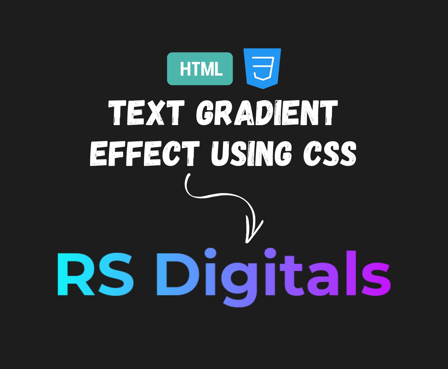
How to Create a Gradient Text Effect Using CSS
If you’ve ever browsed websites and were captivated by the vibrant, captivating text that appears to change hues like a rainbow, chances are that you’ve looked at text with gradients. It’s an easy but effective design method that will instantly make your headlines and branding elements stand out. In this article, I’ll guide you through the steps to make that gradient effect with just CSS. No Photoshop or other fancy design software is required!
Setting up the HTML
Before we dive into the CSS, let’s take a quick look at the HTML structure. Here’s the complete code for setting up the page:
<!DOCTYPE html>
<html>
<head>
<title> CSS Gradient Effect </title>
<link href="style.css" rel="stylesheet" />
</head>
<body>
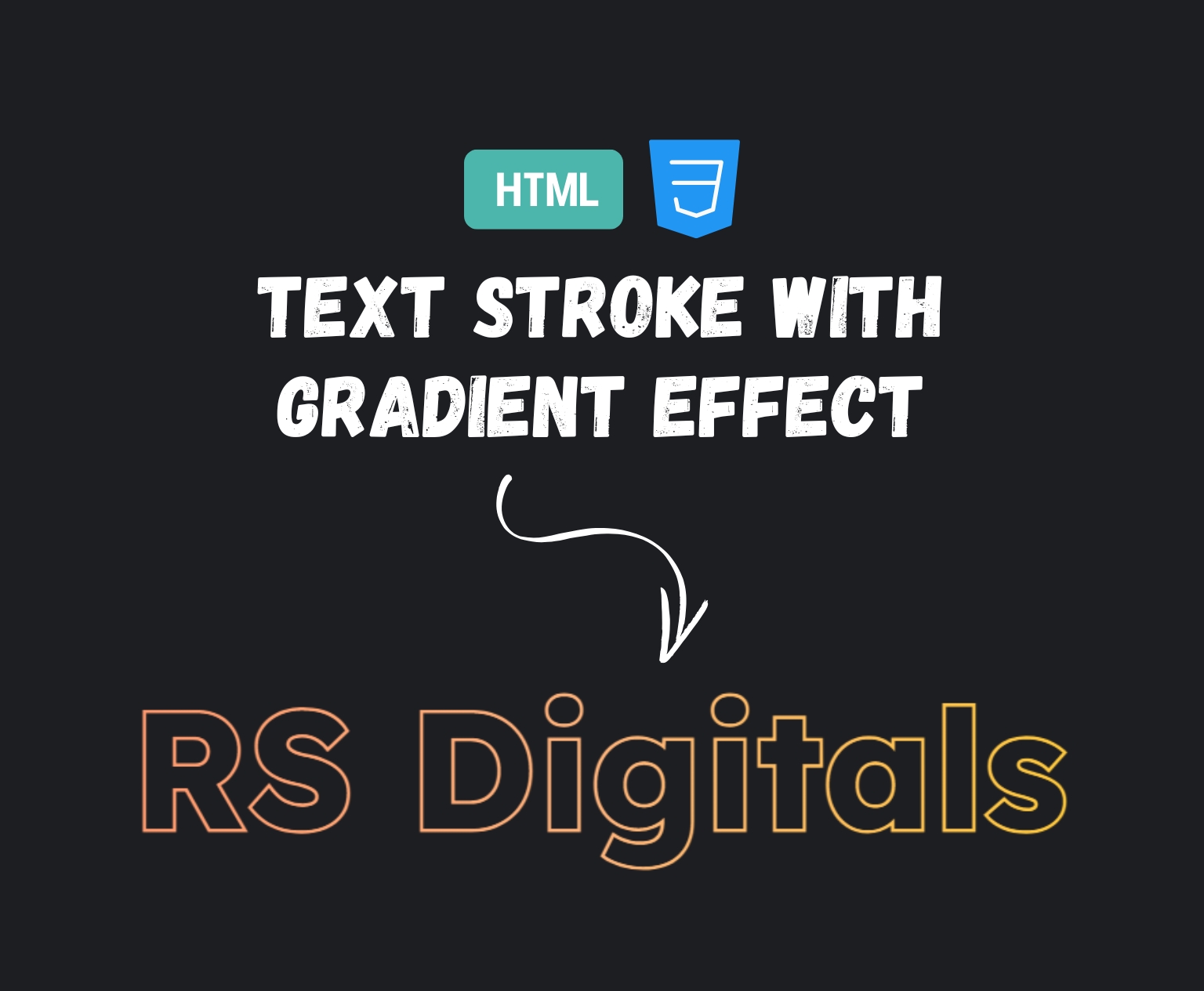
<h1 class="heading"> RS Digitals </h1>
</body>
</html>Here’s a breakdown of what each part of the code does:
<!DOCTYPE html>: This declaration tells the browser that we’re using HTML5 to structure the page.<html>: This is the root element that wraps the entire HTML content.<head>: Contains meta-information about the webpage, like the title and linked files.<title> CSS Gradient Effect </title>: This sets the title of the webpage, which appears in the browser tab.<link href="style.css" rel="stylesheet" />: This is linking to an external CSS file (style.css), where we’ll define the gradient styles.
<body>: This section holds the visible content of the webpage.<h1 class="heading"> RS Digitals </h1>: Here, we’re creating a header element with the text “RS Digitals” and applying the classheading, which we’ll later target with CSS to add our gradient effect.
This is the basic HTML setup, and now that we have our structure, we’ll move on to the exciting part—applying the gradient effect with CSS!
CSS Code for the Gradient Text Effect:
body {
    background-color: #1d1d1d;
}

.heading {
    width: 100%;
    margin: 150px 0px;
    text-align: center;
    font-size: 8vw;
    font-family: "Montserrat";
    background-image: linear-gradient(90deg, #08fffb 25%, #ce08ff 75%);
    background-clip: text;
    -webkit-background-clip: text;
    -webkit-text-fill-color: transparent;
}
Here’s what each part of the CSS code does:
body { background-color: #1d1d1d; }: This sets the background color of the entire page to a dark shade (#1d1d1d) to make the text stand out more..heading { ... }: This is the class where we apply our gradient effect. It targets theh1element in the HTML (with the class “heading”).width: 100%;: This ensures the element takes up the full width of its parent container (in this case, the body of the page).margin: 150px 0px;: Adds space above and below the heading, pushing it away from the top and bottom edges.text-align: center;: Centers the heading text horizontally on the page.font-size: 8vw;: The8vwunit means the font size is 8% of the viewport width, making it responsive. The text size will adjust based on how big the browser window is.font-family: "Montserrat";: This applies the “Montserrat” font to the heading text.background-image: linear-gradient(90deg, #08fffb 25%, #ce08ff 75%);: This is the key part that creates the gradient. Thelinear-gradientfunction generates a gradient from left to right (90deg), starting with a light cyan color (#08fffb) and transitioning to a purple shade (#ce08ff).background-clip: text;: This ensures the gradient is clipped to the text, making it visible only within the letters.-webkit-background-clip: text;: This is a vendor-specific prefix needed for Safari to support the background clipping effect.-webkit-text-fill-color: transparent;: This makes the text itself transparent, so the gradient shows through and fills the text shape.
And there you have it! This CSS will apply a beautiful gradient effect to your text, giving it a modern and vibrant look.
See the Gradient Text Effect in Action
Do you want to witness the effects of text gradients live? Take a look at the live demonstration below! I’ve added a CodePen in which you can view the effects in action. Try out the code, modify it, and then see what happens when you change the font or color—it will make the font look much cooler. This is a fantastic method to play around and become familiar with the way this approach works.
See the Pen Untitled by Rohail Ali (@Rohail1123) on CodePen.
Final Thoughts
Making a text gradient by using CSS is an enjoyable and easy way to add something unique to your site style. This is a method that’s simple to apply and will make the text stand out by giving it a fresh and vibrant appearance. If you’re creating a new site or adding some colour to existing pages, this effect of gradients can increase the appeal of your content. Try it to see if you like it, modify it, and enjoy exploring different combinations of colors!